design selects
design selects
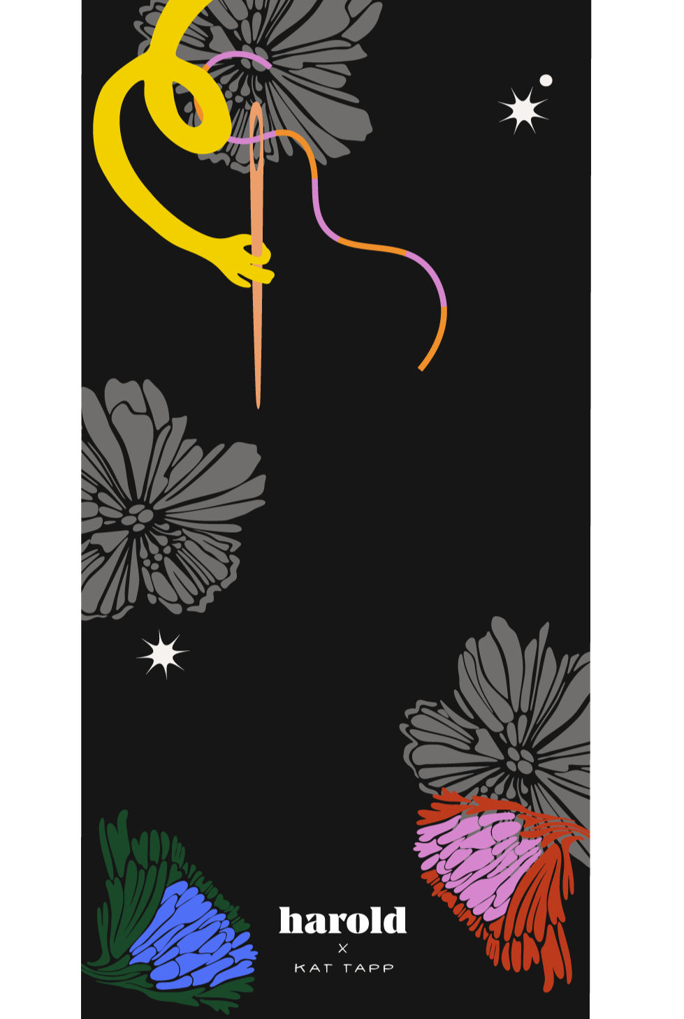
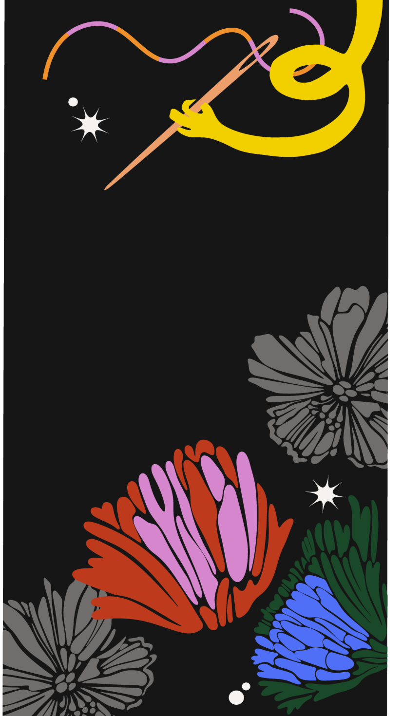
kat tapp x harry rosen: pride 2024
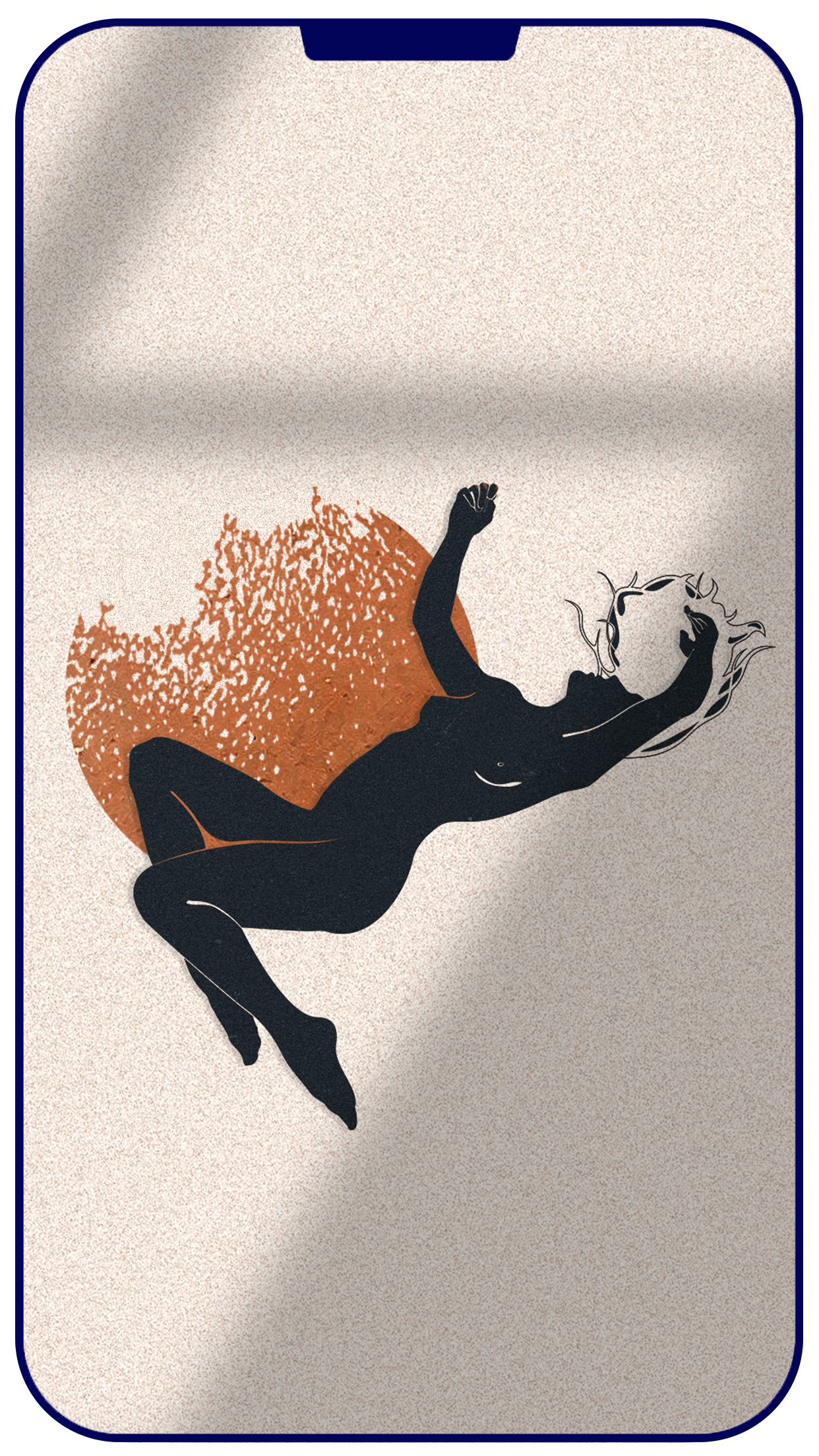
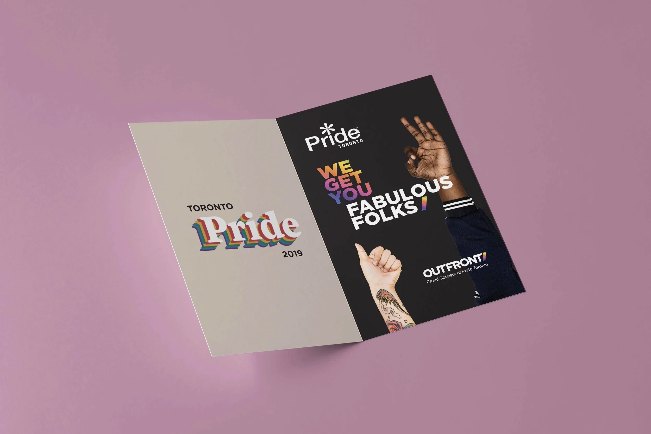
Harry Rosen approached me to create a window display for their Toronto-wide pride campaign. Working with their creative team, I illustrated a modular window display, to be used in Harry Rosen store fronts across the GTA.
Client | Harry Rosen Year 2024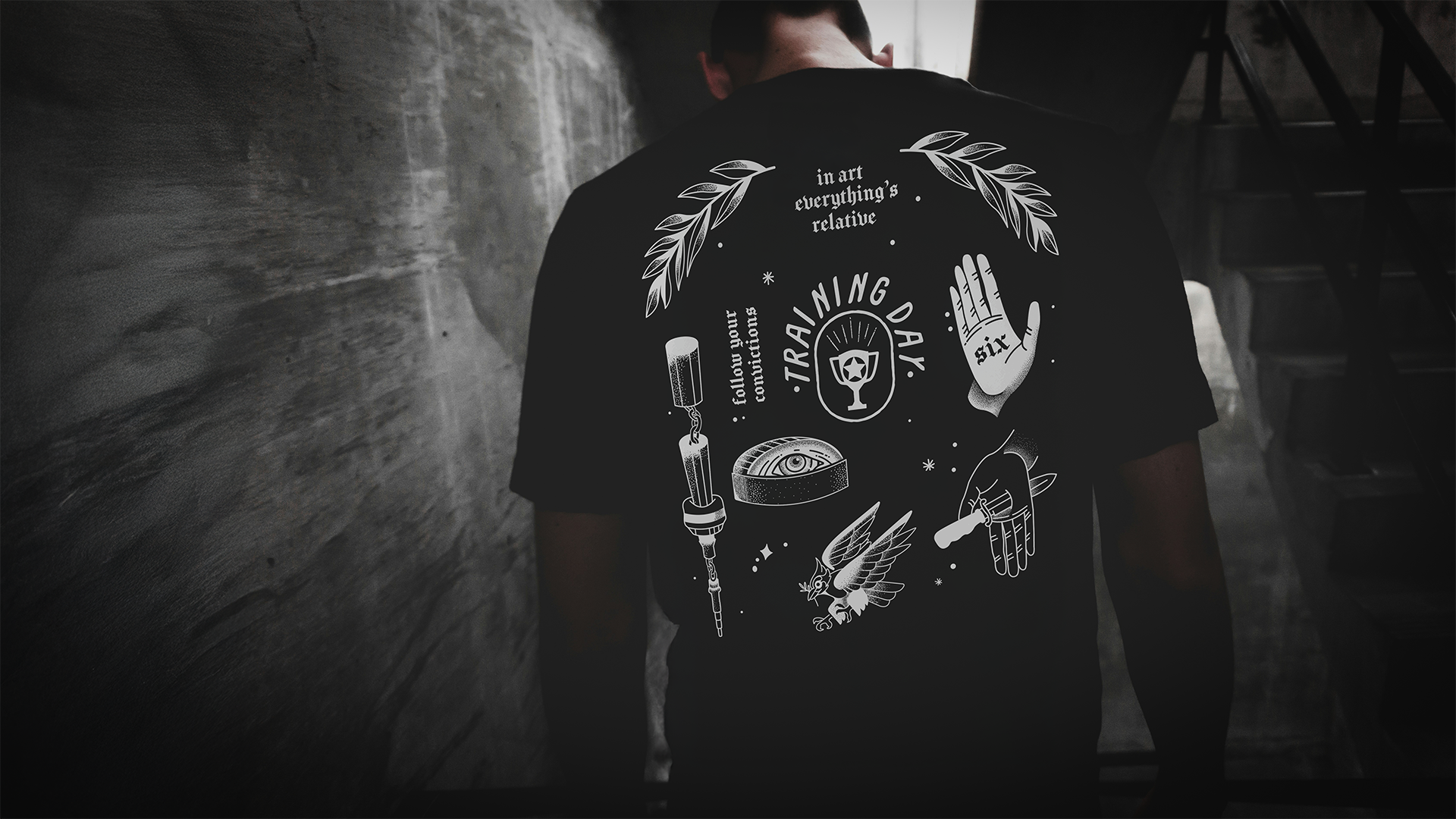
training day media collab
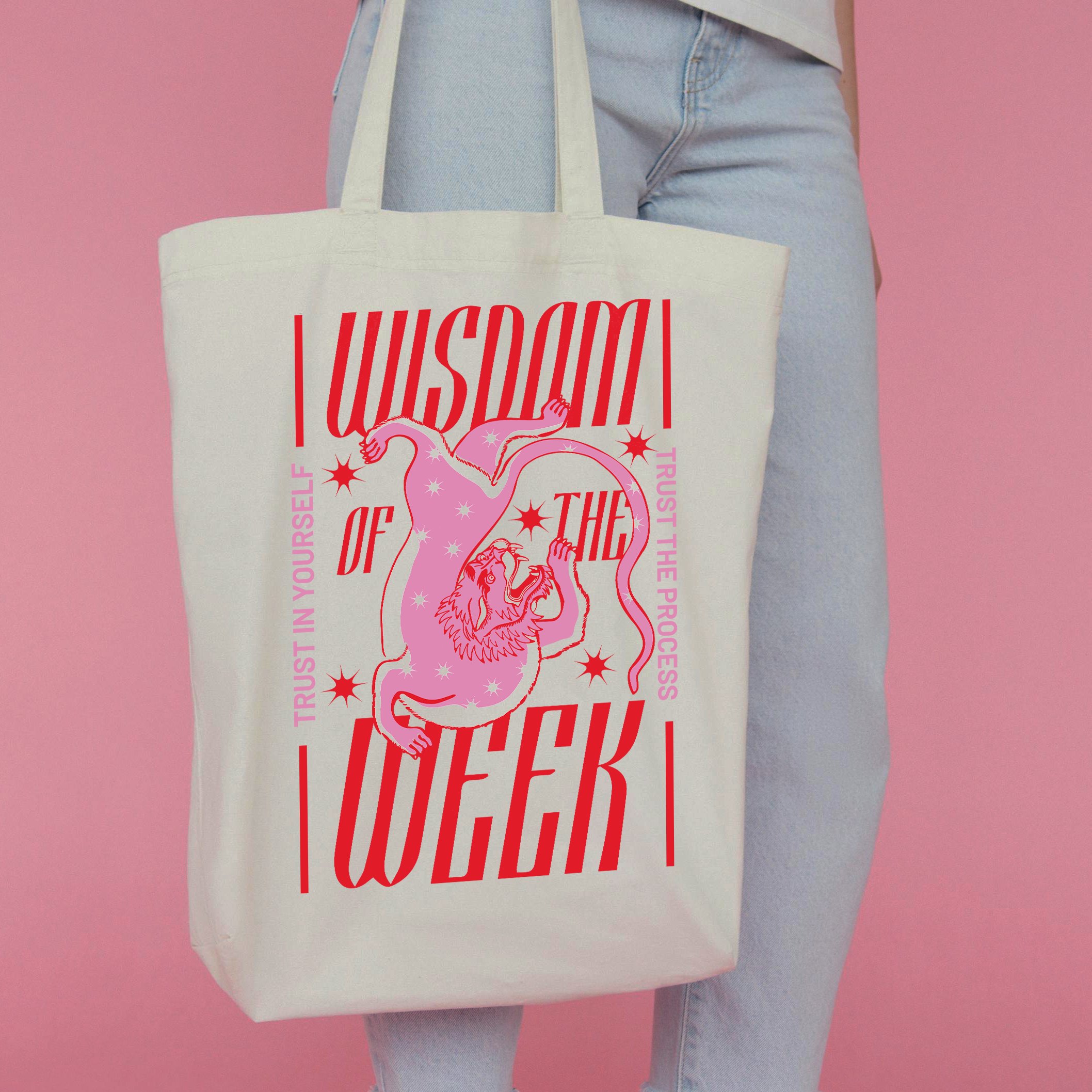
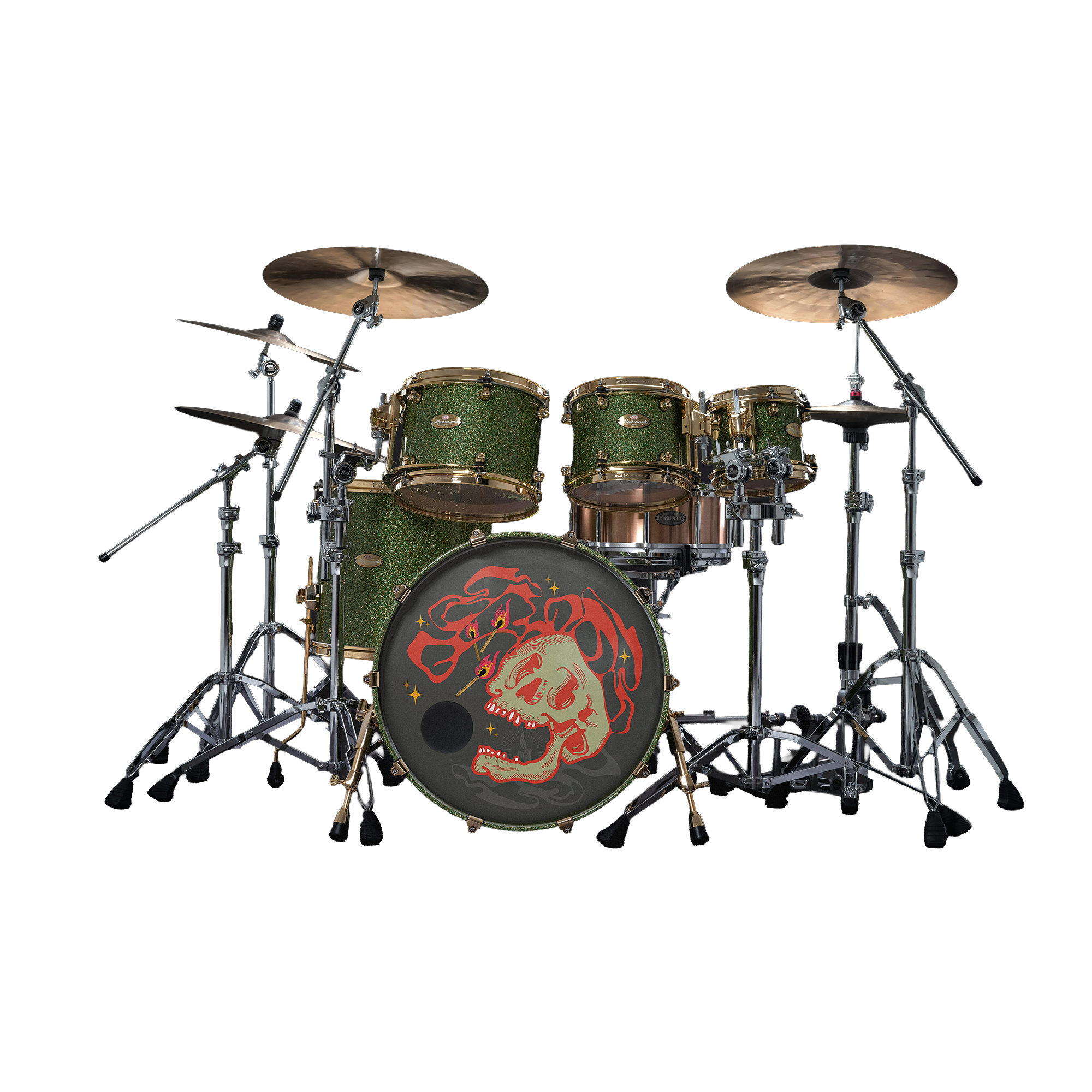
Sports photographer David Soo approached me to create a custom design for his brand Training Day Media. He wanted the design to be representative of the city we both call home, Toronto. David is a motorcycle enthusiast and tattoo collector so I knew the design needed to incorporate those aesthetics. We created a logo that would be exclusive to this collab.
Client | Training Day Media Year 2023
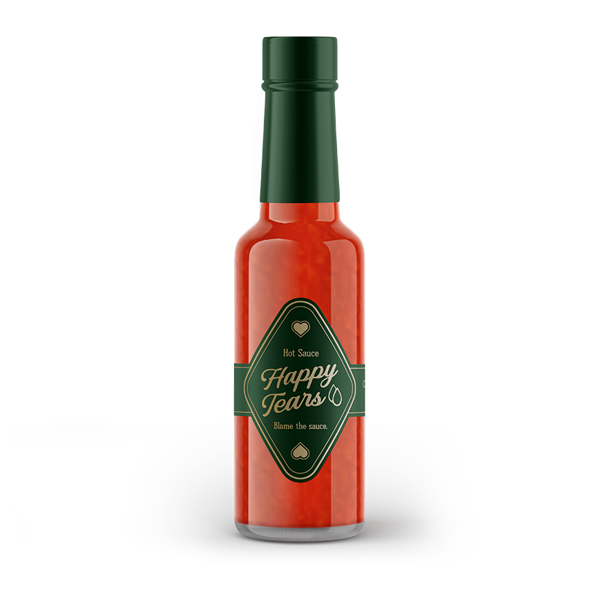
Happy Tears
Custom die cut labels and design for a wedding favour.
brand ID
brand ID
three dollar bill
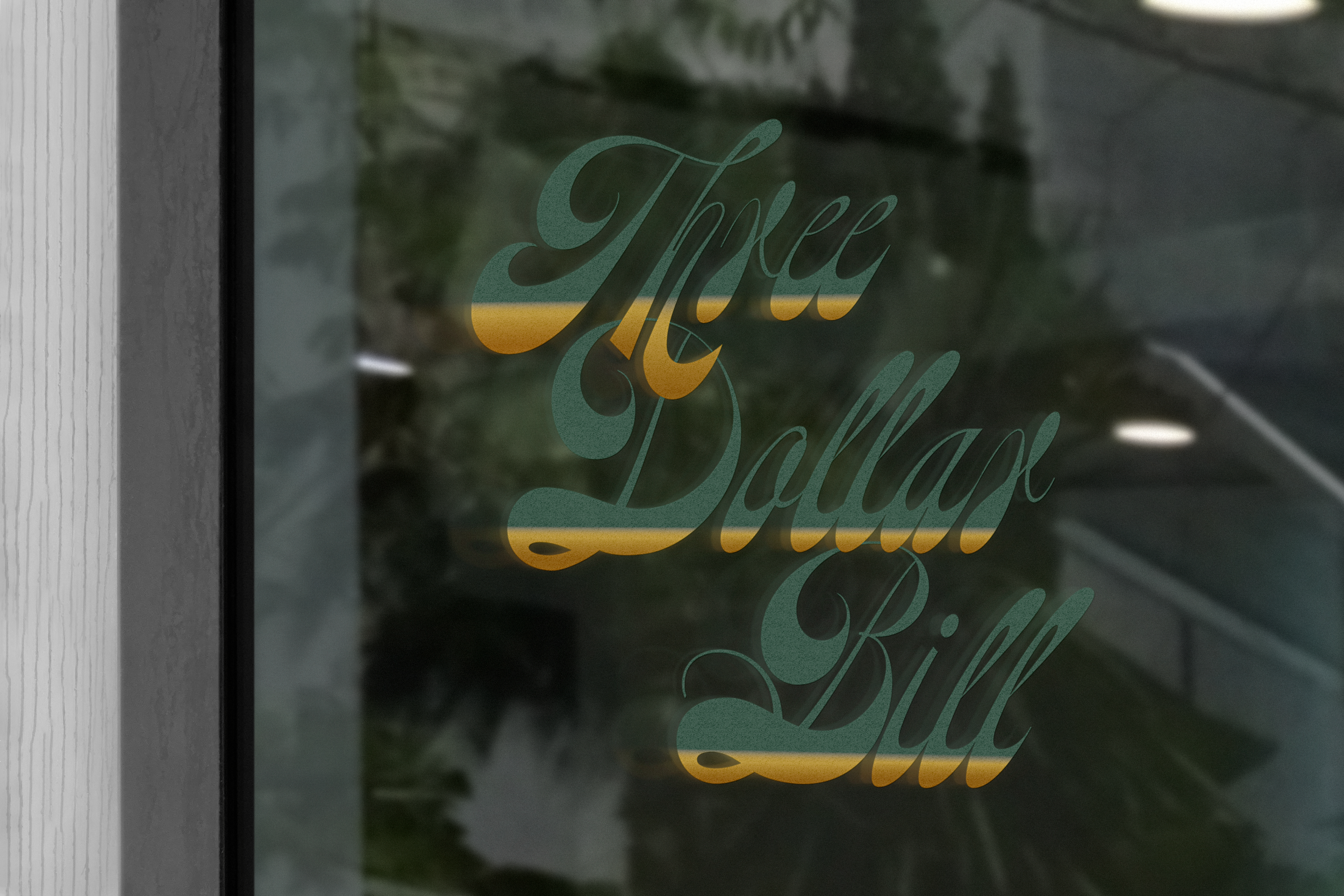
Visual ID for Toronto bar Three Dollar Bill. We worked in parallel to create a consistent brand across all avenues while the interiors of the space were being created.
Outputs included a logo suite and visual brand identity for exteriors, interior assets such as menus, decals, merch, to be rolled out on the website (third party designer).
Client | Three Dollar Bill Year 2023
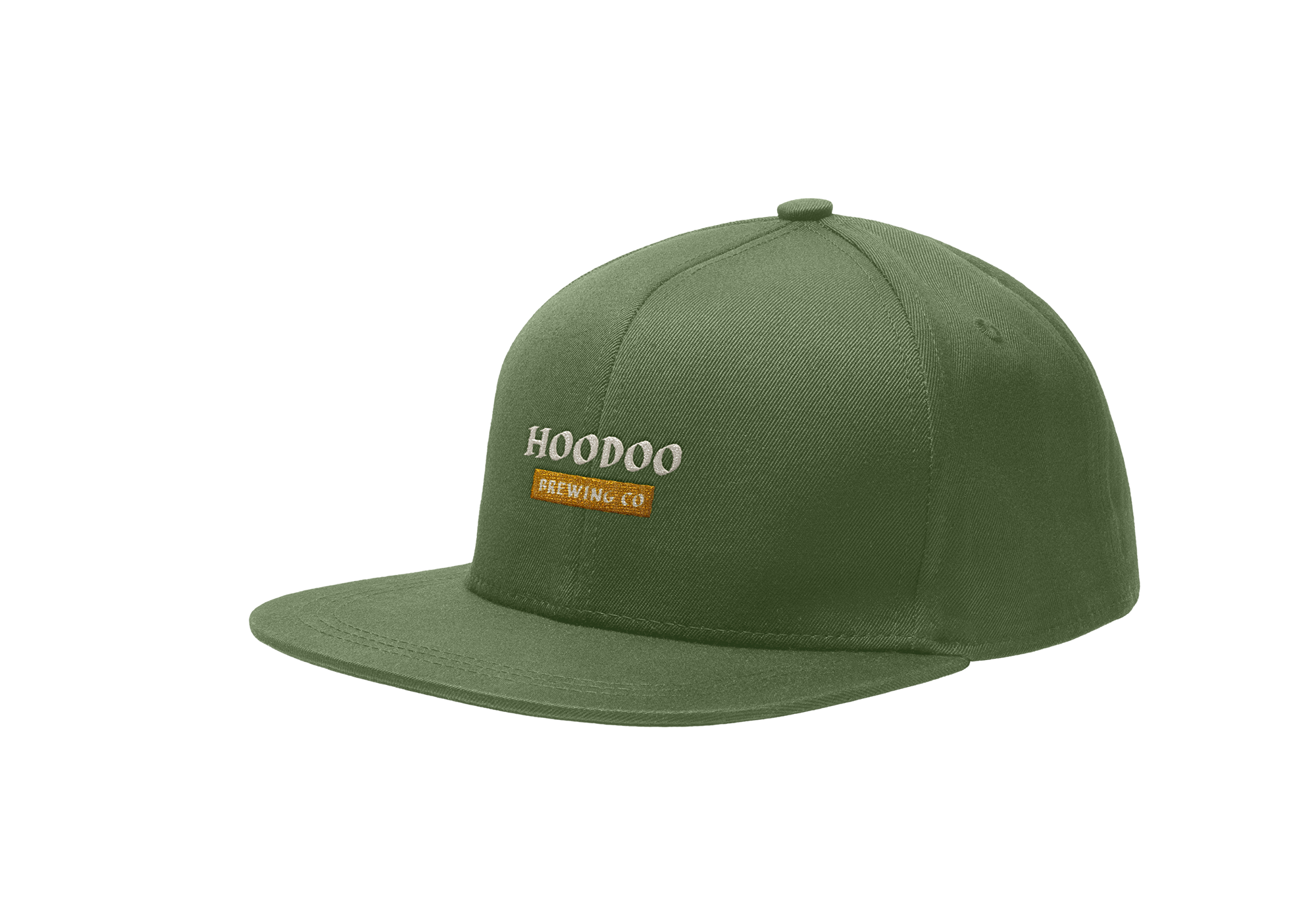
HooDoo Brewing co.


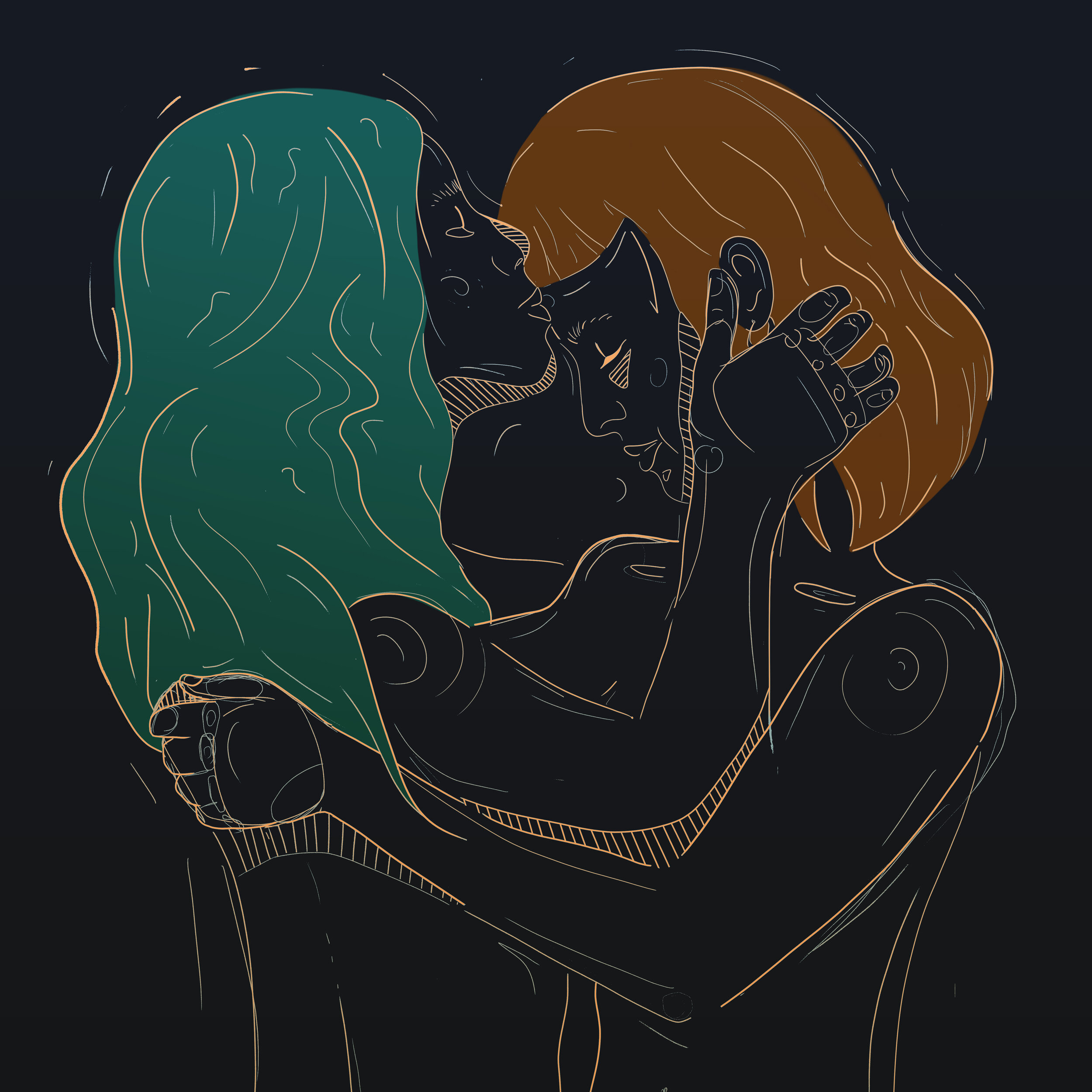
queer run club

QRC wanted to create a logo for their Toronto-based run club; A space for queer folks to come socialize, be silly, feel safe, and drink coffee…running optional.
In talking to MK, we learned that it was important to them that the logo be a symbol of all the things they loved about the community; silly, bold, approachable. If you live in Toronto’s west end, you’ll likely start to see this logo around. If you see them in action, know that it is a safe space for fun and community (and believe me you will see them in their neon!)
Client | QRC Year 2023Ethica x QRC collab
social
social
workplace one
Holiday 2025 Social + Email marketing
Designed & Animated by Kat Tapp
Client | WorkPlace One Year 2022-2024art direction
art direction
Casino Time Launch Campaign
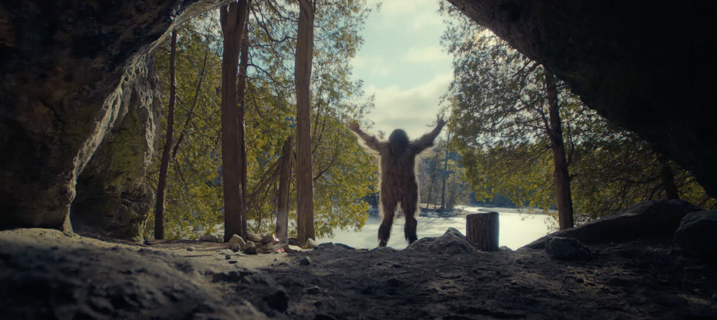
Conceptualized for the launch campaign, I worked with the team to create a suite of assets for the launch of Casino Time web app and brick-and-mortar partners.
Deliverables include; a suite of :30s, :15s spots (currently in market), OOH (including digital programmatic), social assets (paid and organic), and internal brand assets for reproduction.
Creative Direction | Leah Whitney & Amanda Wood (Sister Merci)
Art Direction | Kat Tapp
ACD | Leah Whitney
Production | Headford Productions
Client | Casino Time
2024
The Ultimate 420 collection
For this campaign copywriter Jill Krajewski and I conceptualized the 420 collections, from a short mockup I had created to illustrate our vision on a previous scope for the brand’s in-store campaign. Inspired by this 5-second graphic, the brand asked us to create a 30-second spot, which became Canada’s first commercial spot on digital streaming services.
My social work with Shred Cannabis was nominated for a Clio, Social Media Account of the Year in 2023.
Art Direction | Kat Tapp
Copy Writing | Jill Krajewski
Camera | Micheal Headford
Editing | Eduardo Pares
Client | SHRED (Organigram)
2023
switch health
In this campaign for Switch Health we were tasked to create digital and print assets for the launch of their new product. We created a visually impactful campaign that conveyed the brands messaging.
Client | Switch Health
Art Direction | Kat Tapp
Copy | Leah Whitney
2022
mickey turns 90
My team won a campaign with Disney for a Canadian media buy for the “Mickey In Your City” campaign for the 90th anniversary.
My design team worked closely with Disney and its brand guidelines to create a digital ad campaign. My design team worked with the marketing team to roll out nationwide assets including digital programmatic assets, land-based, and PR considerations in Toronto, Vancouver, and Calgary.
Lead Design | Kat Tapp
Designer | David Chiu
Client | Disney
2018
jr strain brand launch
Creative Direction | Amanda Wood
Art Direction | Lead Design: Kat Tapp
Copy Writing | David Shermer, Leah Whitney
Costume Designer | Susan Dicks
Client | Dycar Pharmaceuticals
Year 2023
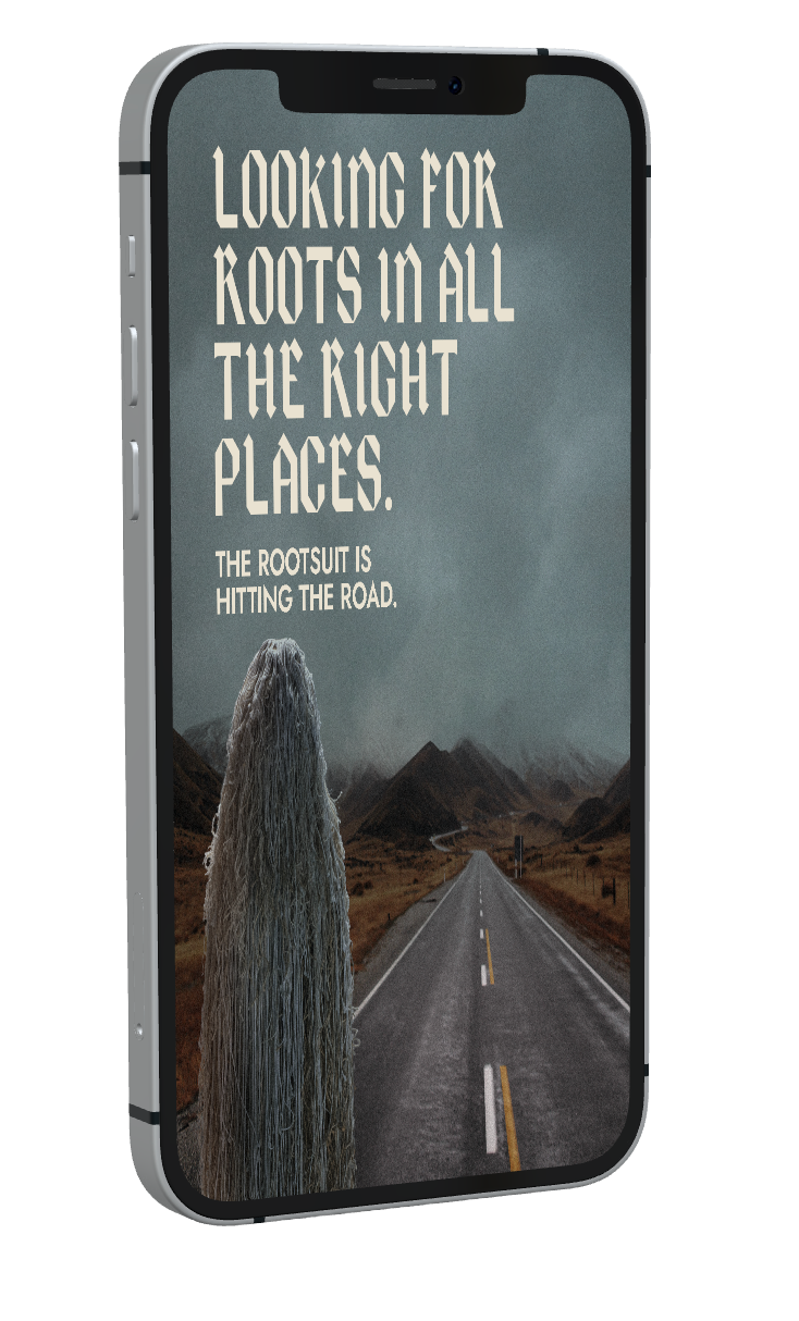
Through this social launch campaign, we teased out the visuals of the Rootsuit. Working with copywriter David Shermer, we created a series of assets to promote the relaunch. We used the suit as an opportunity to tell JR Strain’s brand story, while still adhering to the Cannabis Act rules (which stipulate marketing cannot feature either people or animals). We shot the costume in studio and directed the post to create the final assets. This work was nominated for a Clio award in 2023.
jr strain XM
For the brands debut, we brought the Rootsuit from Alberta to Ontario for the Kind Summer Fair. I designed a booth for this trade show alongside local producers to create an impactful introduction to the brand in Eastern markets.
Art Direction | Lead Design: Kat Tapp
Copy Writing | Leah Whitney
Costume Designer | Susan Dicks
Client | Dycar Pharmaceuticals
2023